

Branding for a campaigning voice
The project.
Working with digital agency Bespoke, I helped the e-Assessment Association (eAA) revitalise their brand and website to better support their role as an influential, independent voice in e-assessment.
Despite their expertise, their impact was being limited by an outdated website and a brand that lacked clarity, flexibility and digital presence. This project focused on creating a more accessible, distinctive and scalable identity to support their future growth.
Project overview.
Client: e-Assessment Association, with Bespoke Digital
Project: New brand identity and website design
Services: Logo design, Brand development, Brand guidelines, Website design
Timeline: 3 months
Outcome: A refreshed brand identity, clearer positioning and a flexible website design system to support ongoing communications
The brief.
The eAA is a respected and influential organisation, providing guidance and thought leadership in the development of e-assessment. However, their brand and website did not reflect the quality or authority of their work.
The existing identity felt dated and inconsistent, while the website lacked clarity and usability. Together, these issues made it harder for the organisation to communicate its value and engage its audience effectively.
The brief was to create a more modern, accessible and digitally-focused brand and website that would better represent the eAA’s role and amplify its voice.
Discovery.
Building on the outcomes of a strategy workshop, I carried out a review of how the eAA brand was currently used across key touchpoints, including their website, webinars, communications and annual conference. I also looked at comparable organisations within the sector.
This process highlighted several key issues:
A limited visual language that struggled to adapt across different types of content
An over-reliance on a single colour and generic design elements
A lack of distinction from similar organisations
No clear positioning statement to articulate the organisation’s purpose and value
These findings were brought together in a Design Sprint, where we aligned with stakeholders and the eAA sponsor group on priorities and opportunities for improvement.
Encouragingly, there was a shared recognition that the brand needed to evolve significantly, creating space for a more ambitious and effective solution.
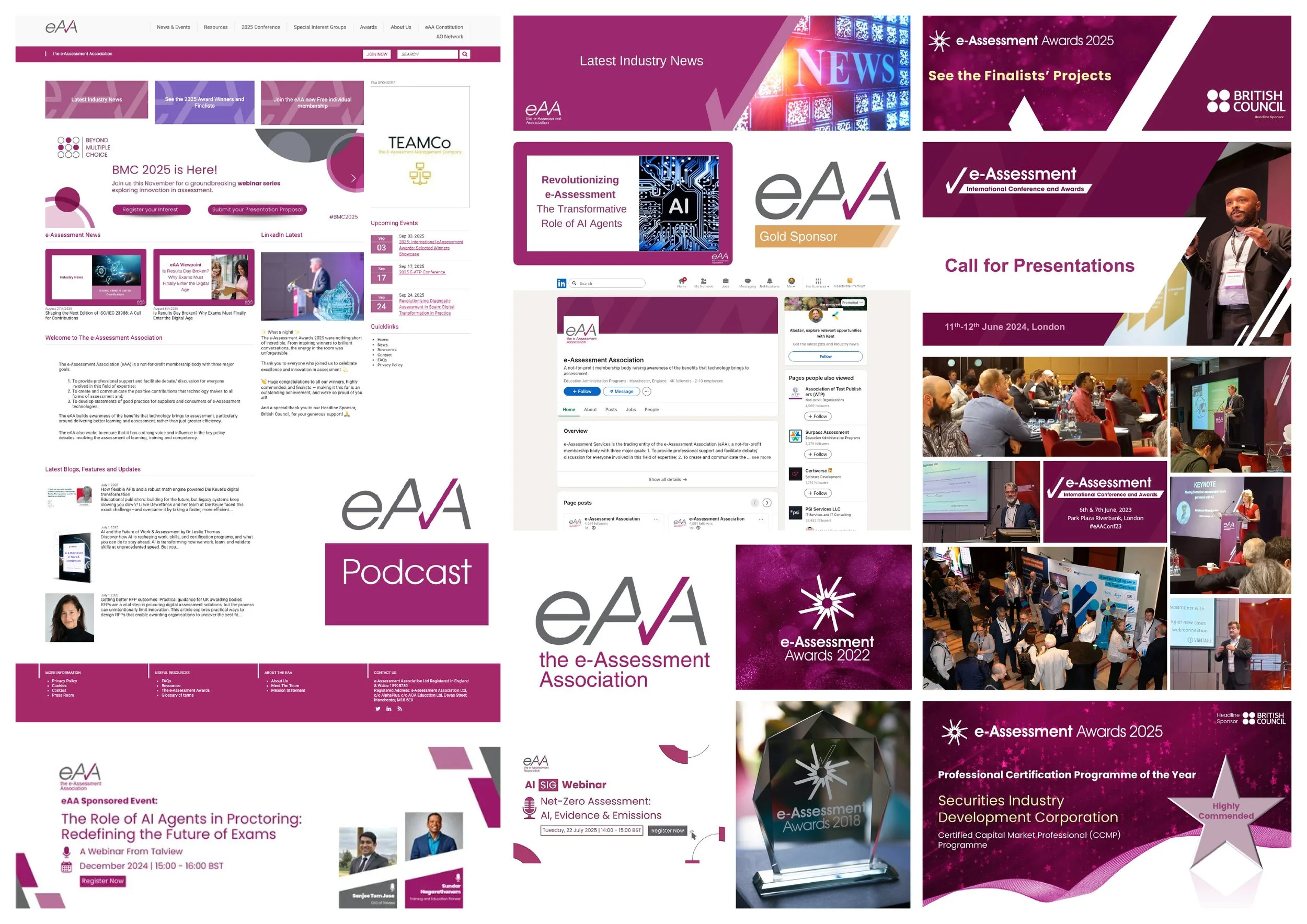
Examples of the existing eAA branding
Concept development.
A key early opportunity was to define a clear positioning statement. Working collaboratively, we developed three options that captured different ways the eAA could articulate its role and value.
In parallel, I explored three distinct creative directions for the brand identity:
A bold, minimal approach focused on authority and clarity
A softer, more accessible direction communicating guidance through complexity
A tech-inspired, dynamic approach, underpinned by clarity and ease of understanding
Each direction introduced new combinations of colour, typography and visual language, ranging from orderly to more expressive and characterful.
Through presentation and discussion, it became clear that a less corporate, more approachable direction resonated most strongly with stakeholders. Key themes emerged around the desired tone of the brand:
Soft, friendly and welcoming
Clear and easy to understand
Structured and ordered
While the initial logo concepts didn’t hit the target, the broader visual direction of the third concept, with its blend of soft colours, characterful highly legible typography and simple, understandable graphics provided a strong foundation to develop further.
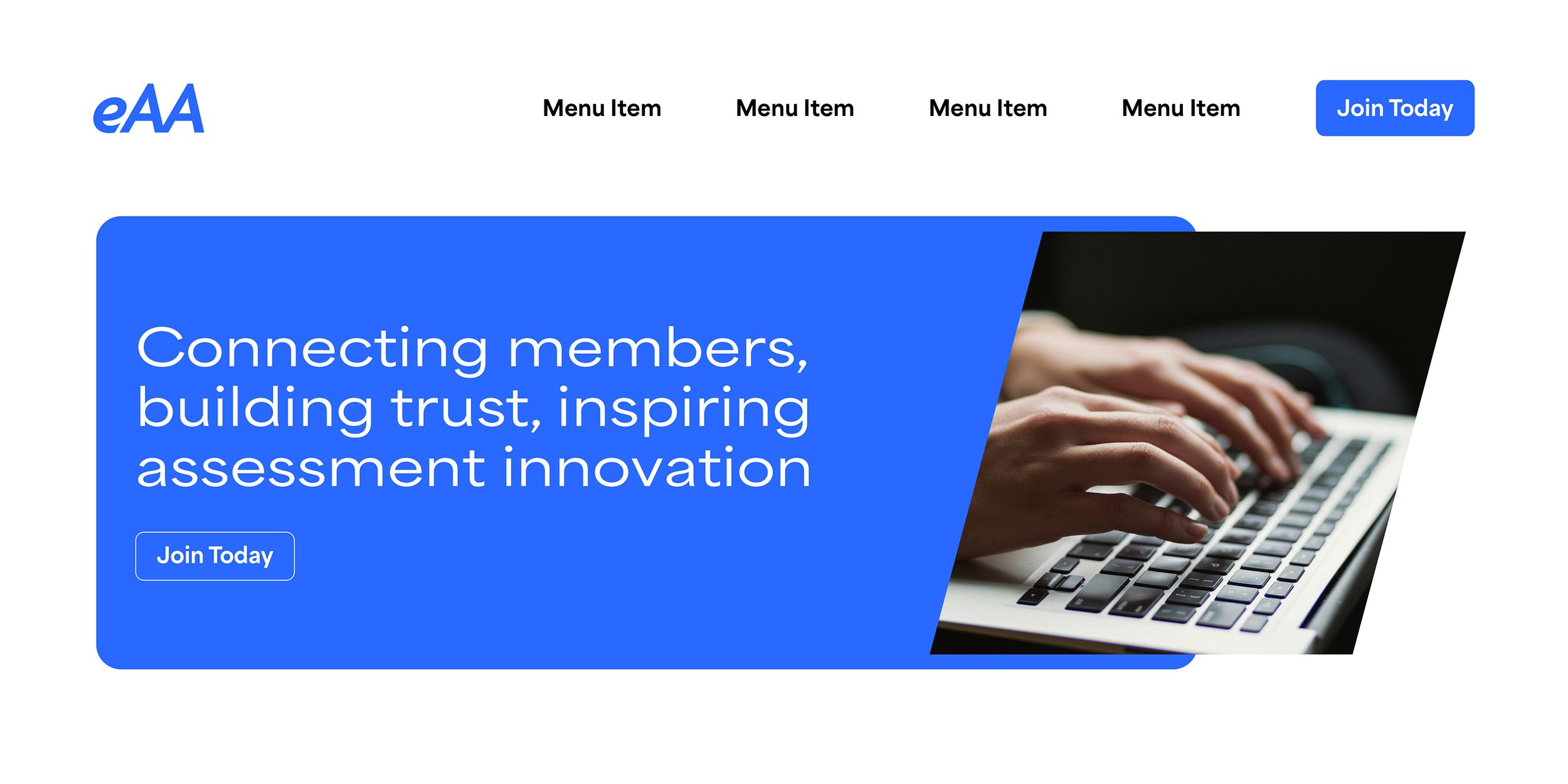
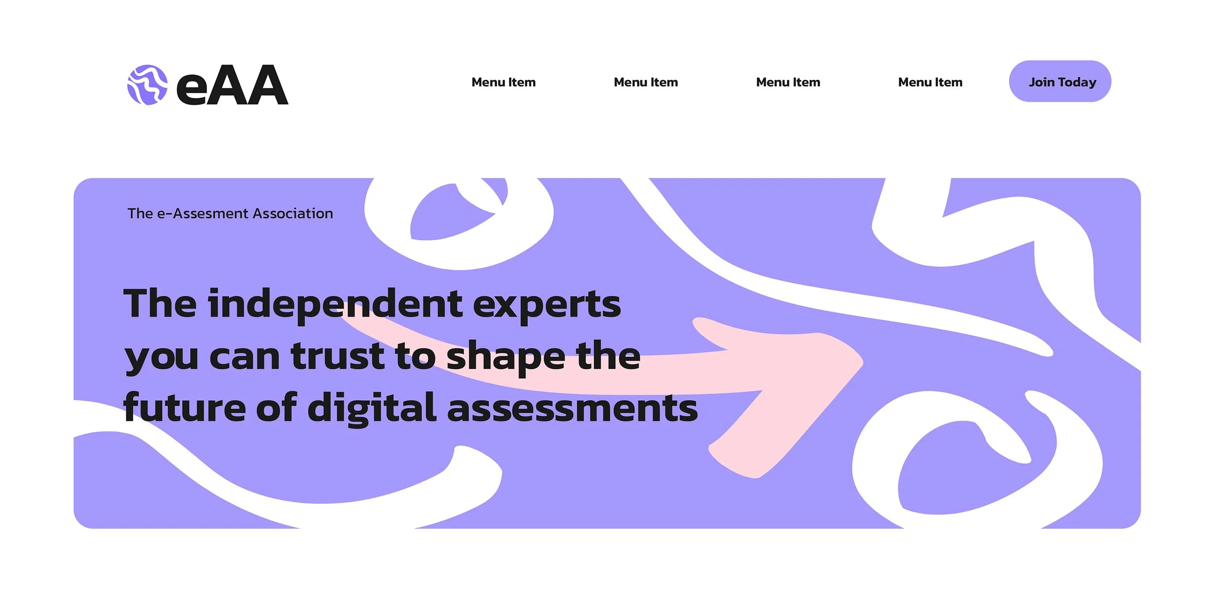
Three concepts were developed exploring a range of approaches
Design.
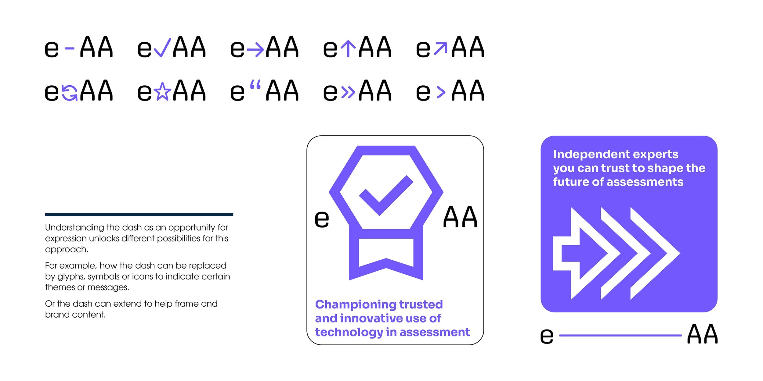
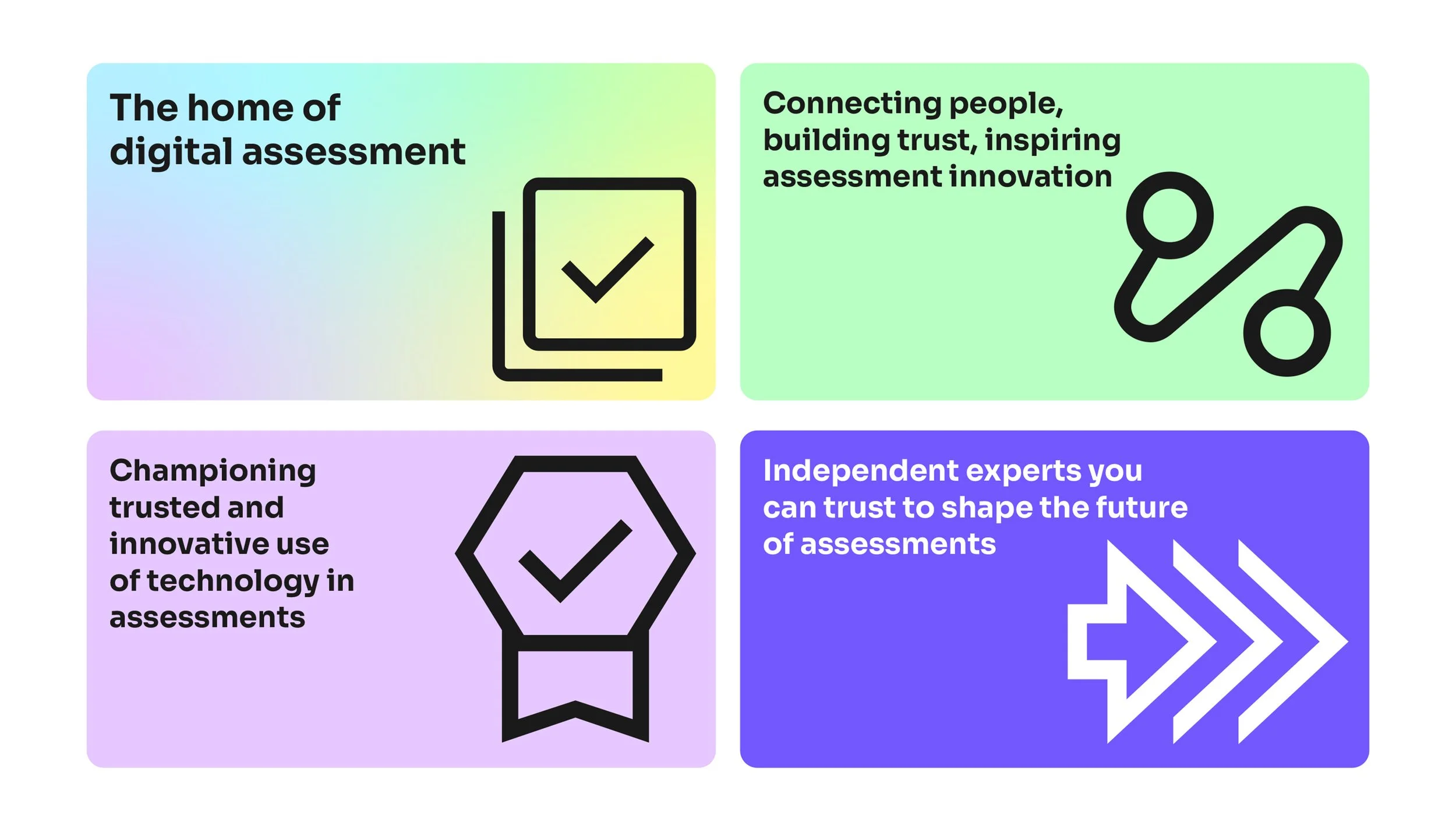
Building on the preferred direction, I developed a further logo. This featured an expressive ‘e’ symbol emerging from a location marker form, inspired by the positioning idea of “the home of digital assessment”. This created a distinctive and meaningful visual with the same approachable feel of the wider identity.
A new colour palette was introduced, with purple as the primary brand colour. This helped the eAA stand out in a sector often dominated by more conservative tones, giving the organisation a more confident and recognisable presence. Supporting colours and gradients added flexibility, allowing different types of content to be clearly differentiated while maintaining consistency.
Typography and graphic elements were chosen for clarity and legibility, ensuring the brand remained accessible across digital platforms. Simple iconography and soft visual details reinforced a friendly, modern feel.
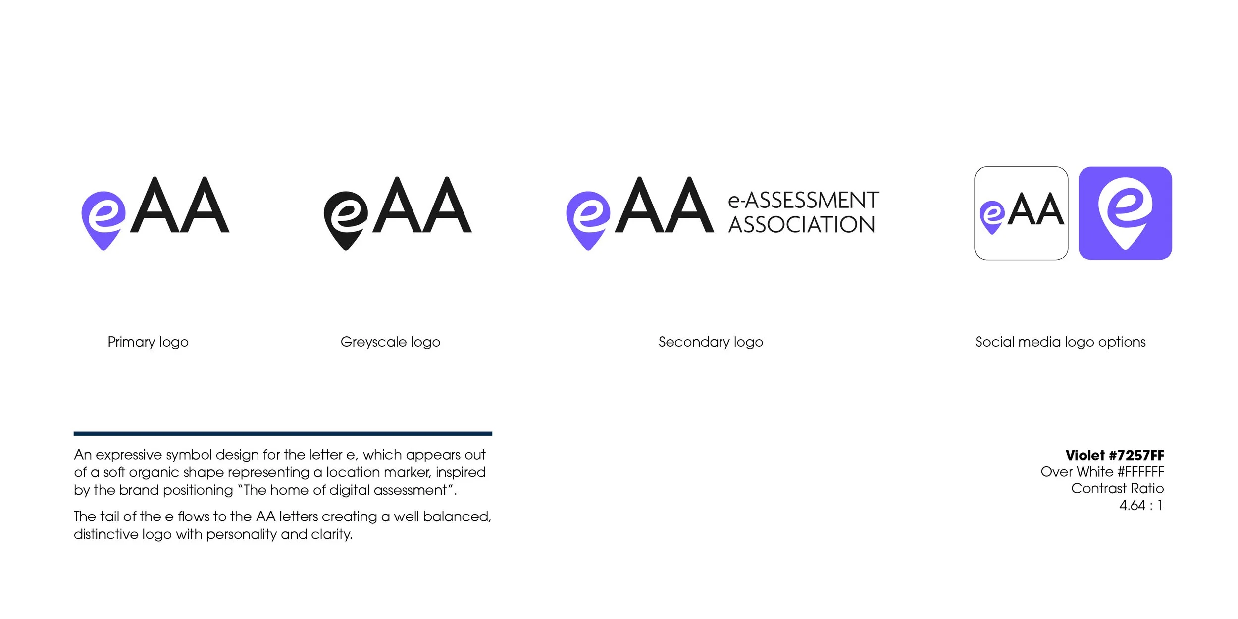
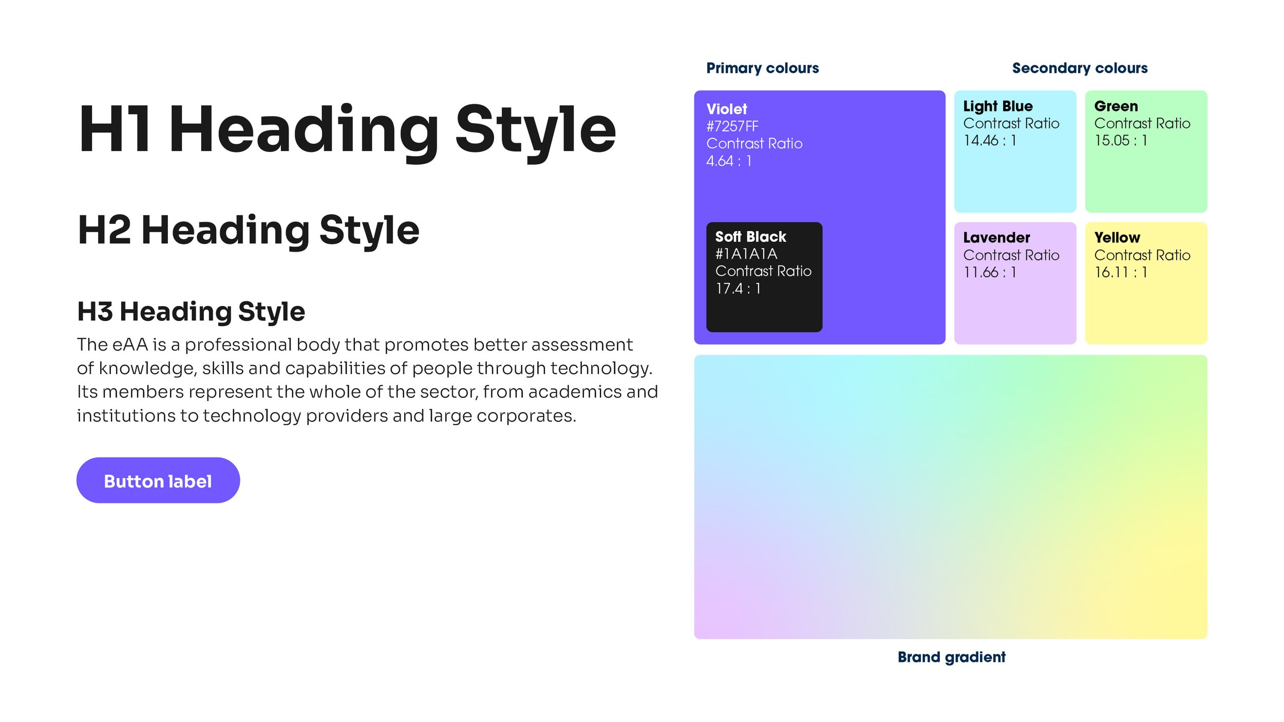
The chosen logo design with its variations and other elements from the new identity
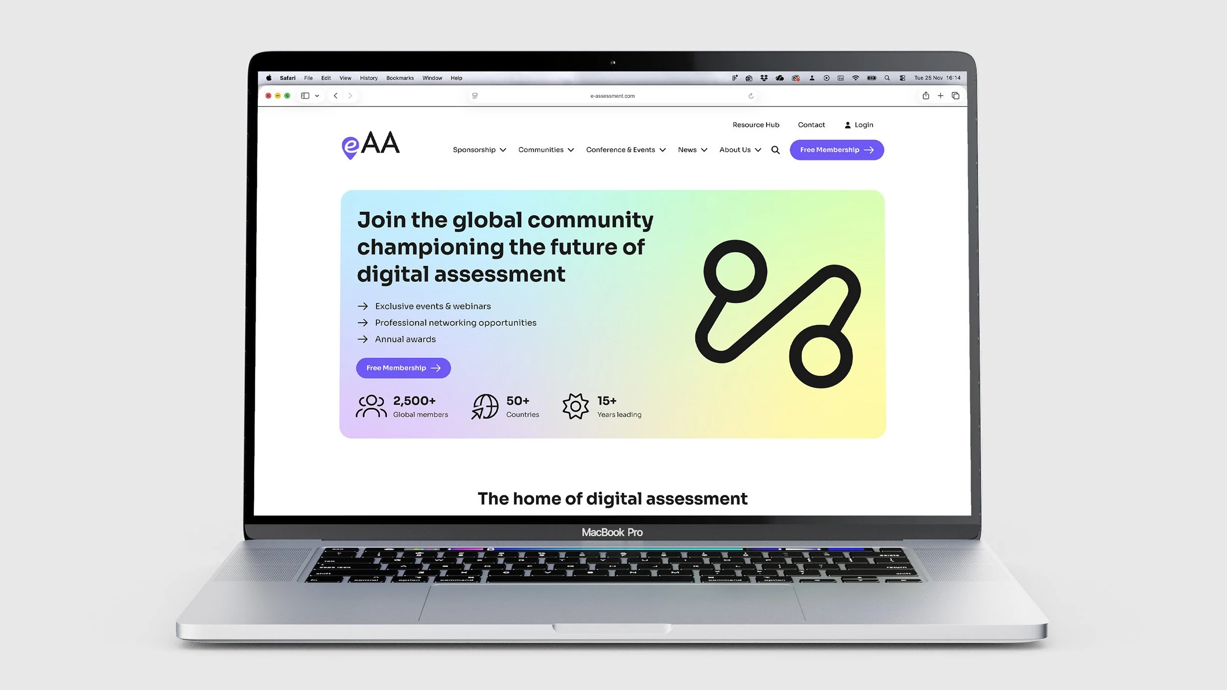
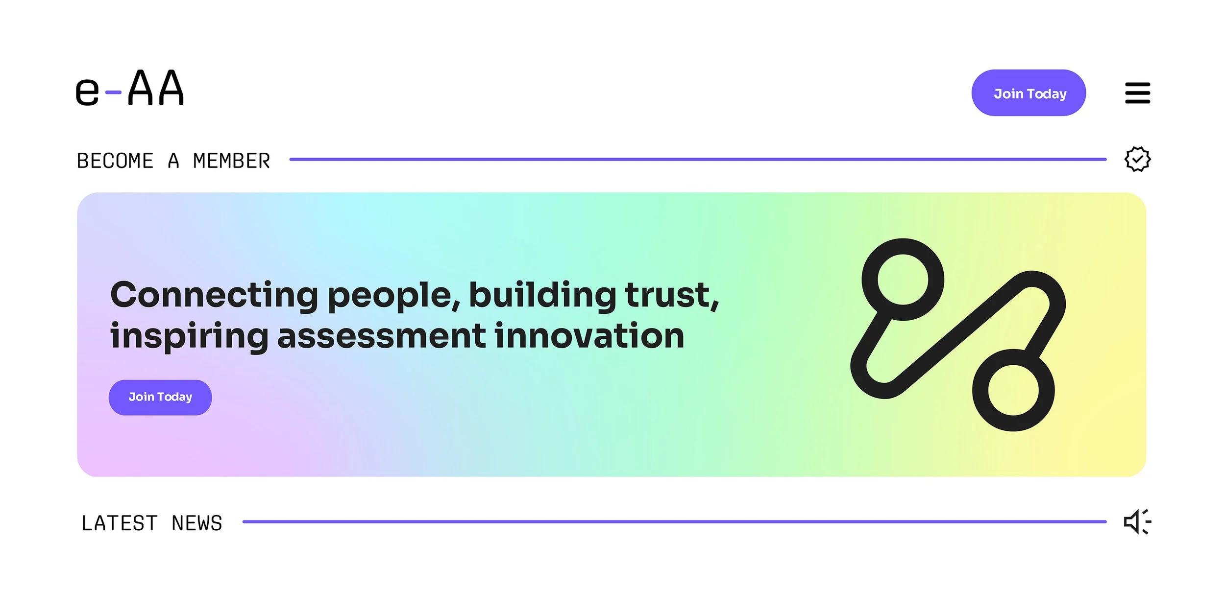
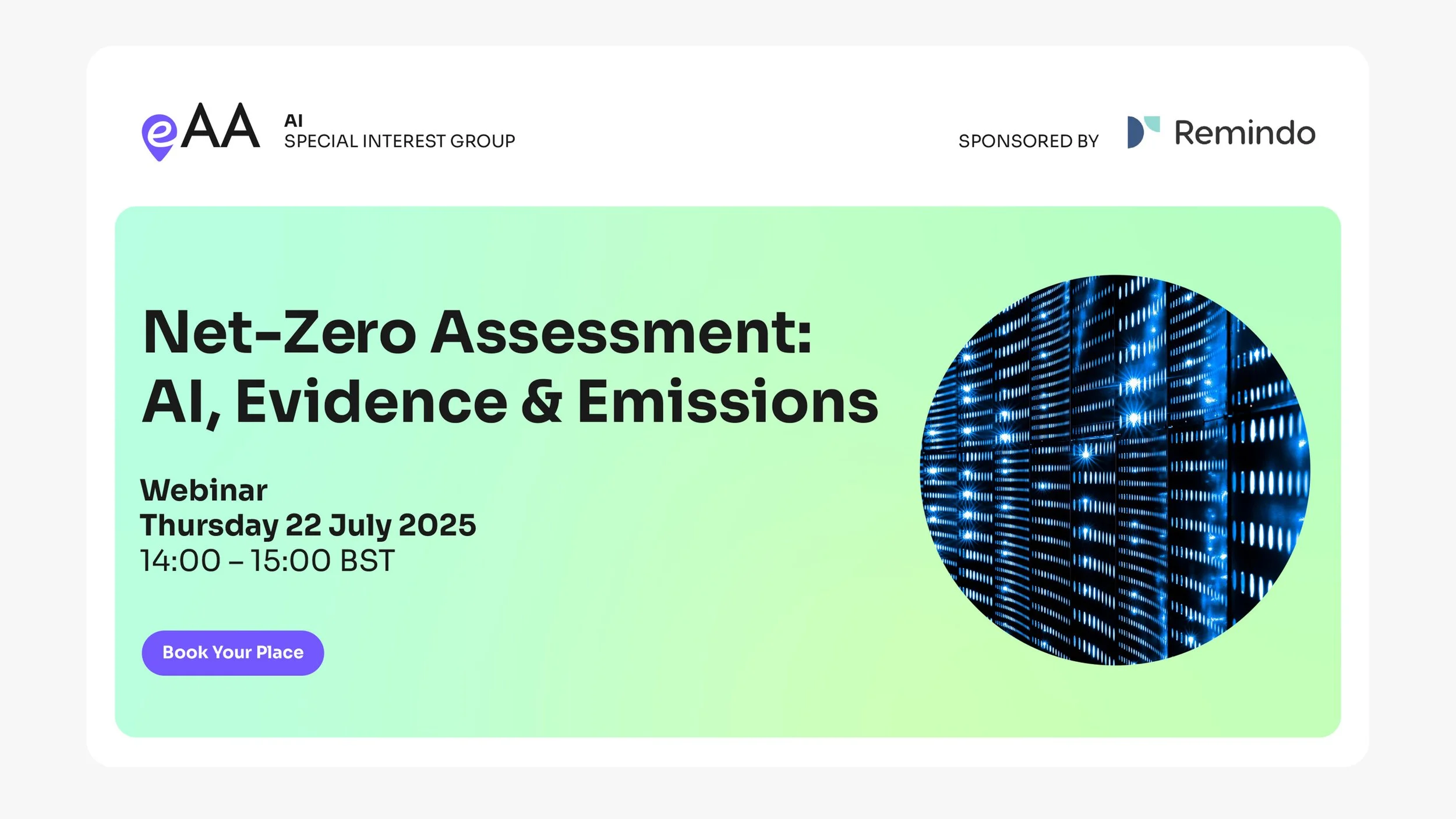
The website design brought these elements together into a flexible, modular system. Content blocks were designed to stack and adapt seamlessly across devices, supporting a clear and intuitive user experience. Curved forms and considered use of imagery helped create a more engaging and contemporary digital presence.
Over a month, a full set of responsive page designs were created and handed over to Bespoke’s developers, providing a clear framework for build.
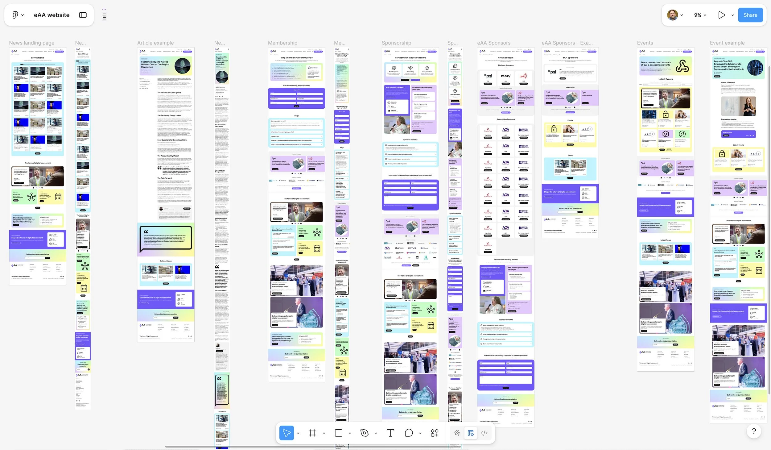
Website designs helped to flesh out the brand identity and show how it could scale
Artwork & guidance.
To support consistent implementation, I created a comprehensive brand library including logo assets for digital and print use, along with a concise brand toolkit.
This provided clear guidance on typography, colour, layout and supporting graphics, enabling the eAA team to confidently produce their own content while maintaining a cohesive visual identity.
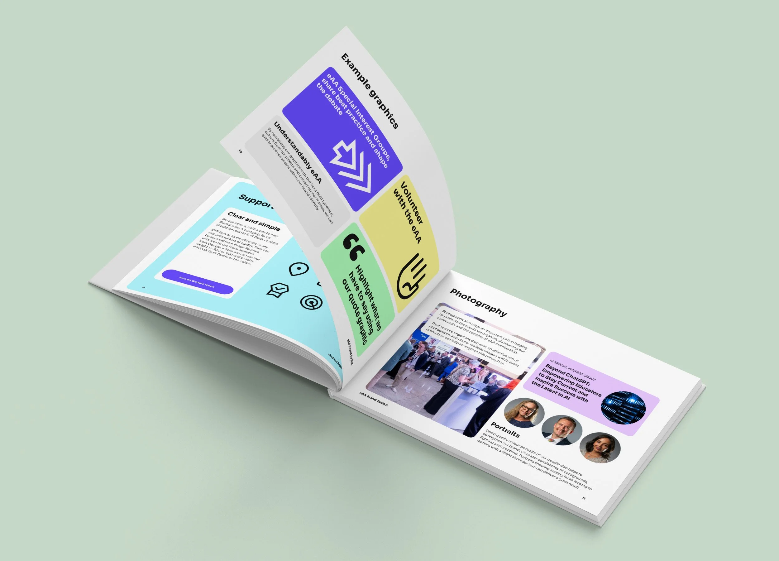
A brand toolkit was produced to help guide the eAA in using their new branding
Design highlights.
A revitalised brand with a clearer, more confident proposition
A digital-first identity reflecting the eAA’s focus on e-assessment
A flexible visual system to support a wide range of content
A collaborative process shaped by stakeholder insight and feedback
Like what you’ve seen?
This was an interesting project with a very engaged client. Constructive discussions were had throughout and listening carefully helped the right decisions to be made. The result is a clear, modern and adaptable brand and new website that better reflects the eAA’s expertise and supports their role as a leading voice in digital assessment.
If you’d like to discuss a similar project, or share your thoughts, please get in touch.