

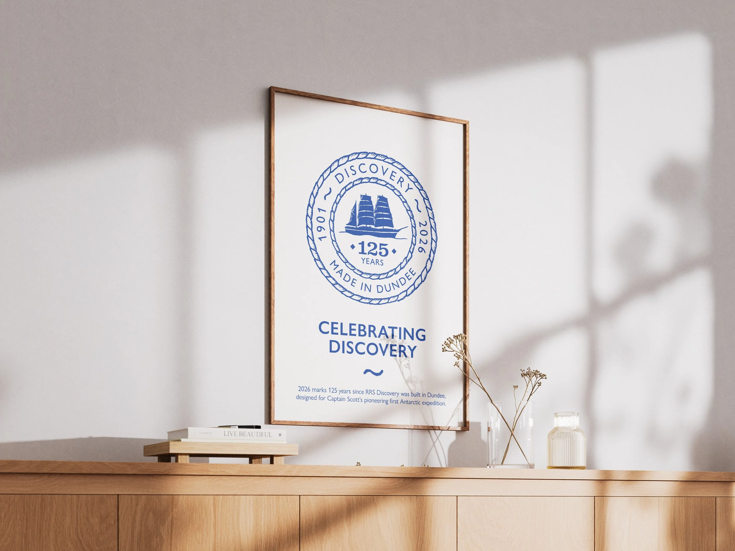
Celebrating 125 Years of RRS Discovery
The project.
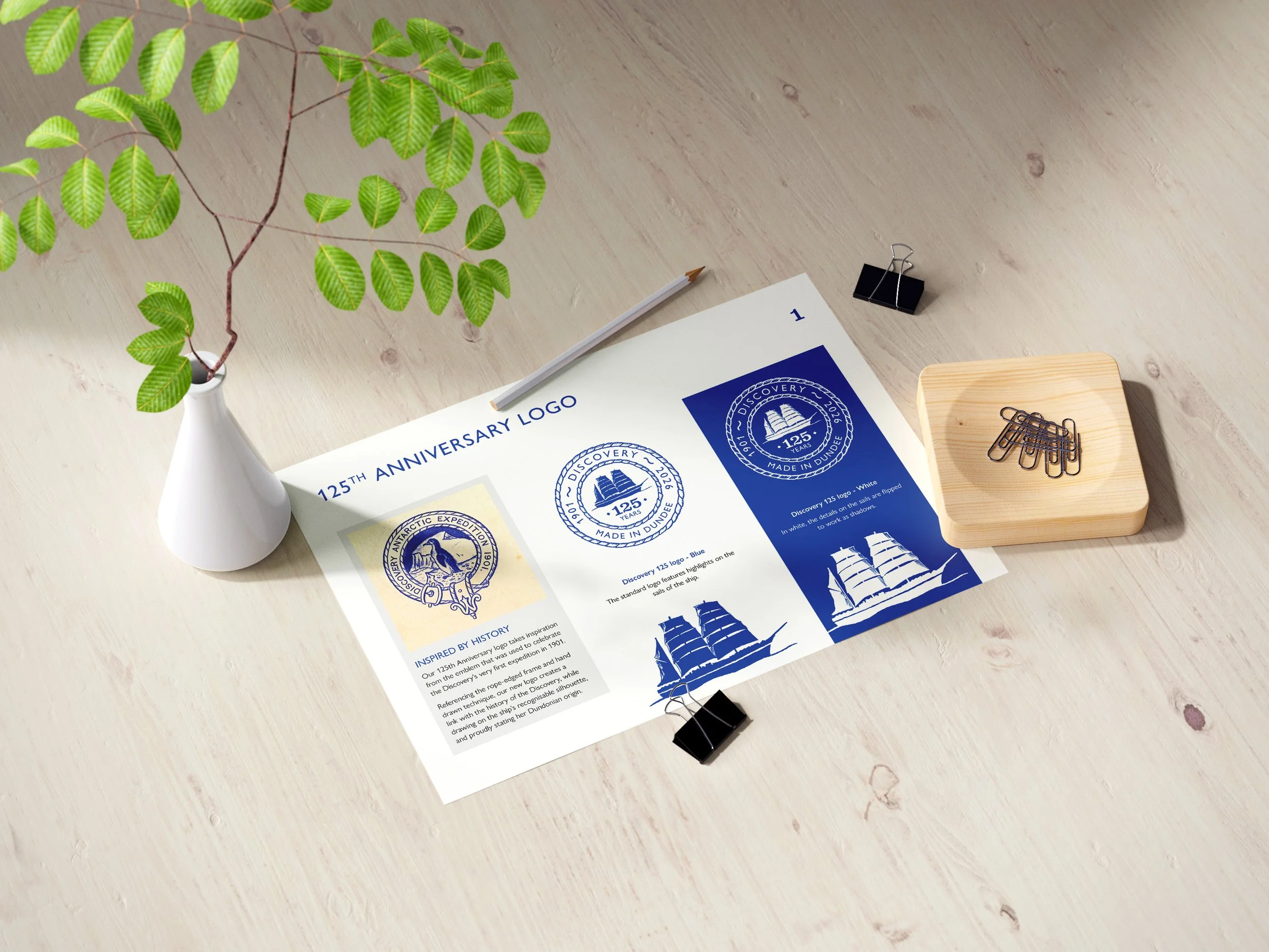
To mark the 125th anniversary of the launch of RRS Discovery, Dundee Heritage Trust commissioned me to design a commemorative logo for the celebrations and associated merchandise.
Drawing on archive material from the ship’s first Antarctic expedition, the final design captures the character of the era while working clearly for today’s applications.
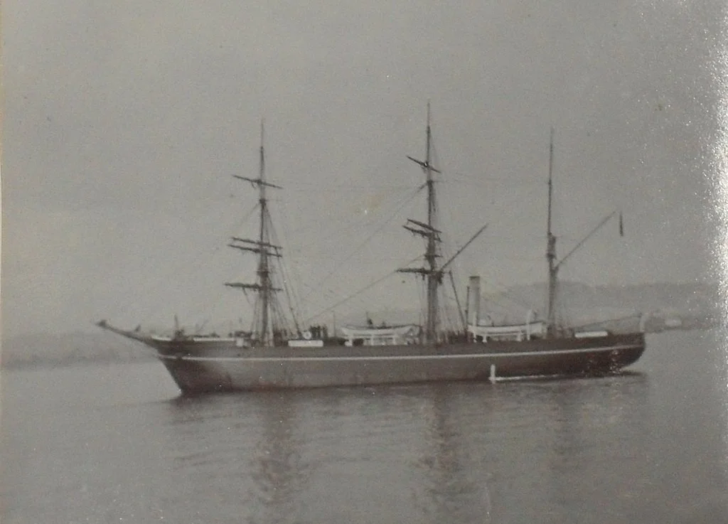
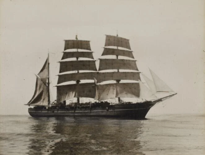
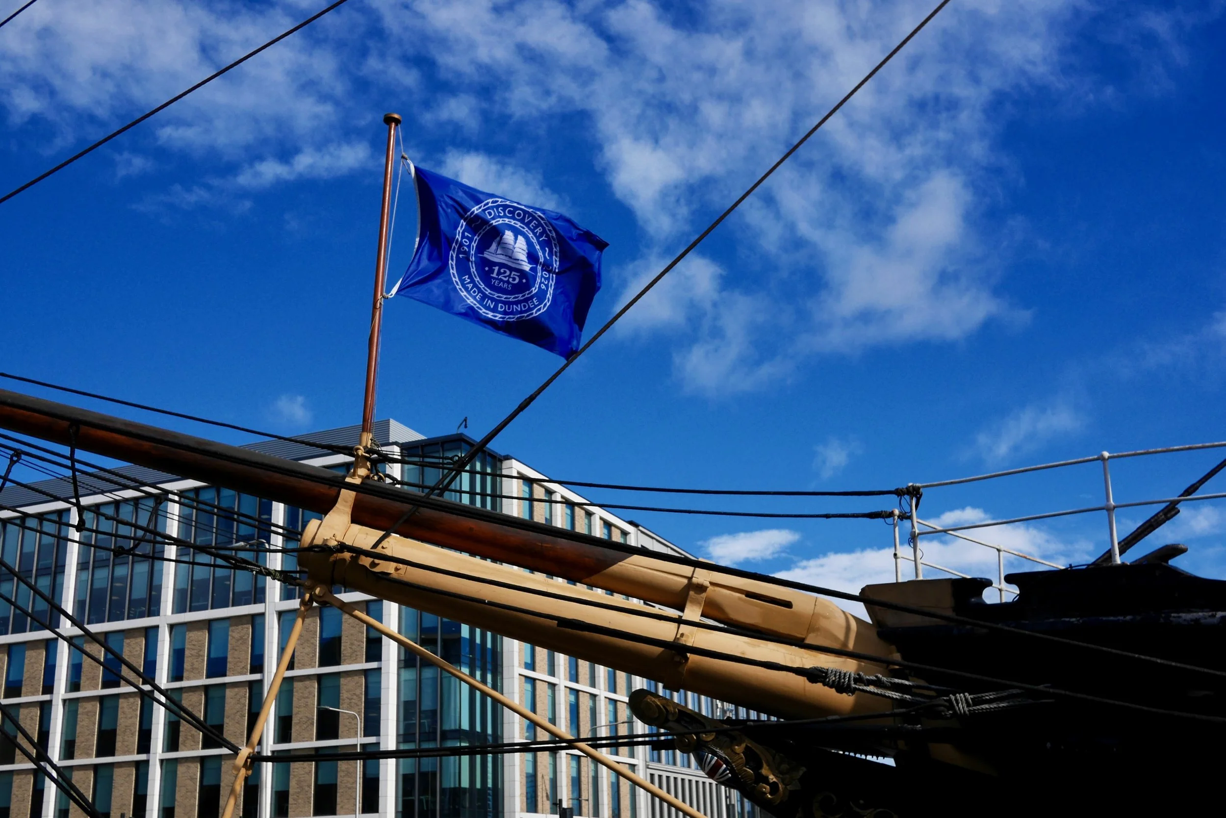
RRS Discovery at Discovery Point, Dundee – the historic research vessel built for Captain Scott’s first Antarctic expedition
Project overview.
Client: Dundee Heritage Trust
Project: 125th Anniversary Logo – RRS Discovery
Services: Logo Design, Brand Development, Artwork Production
Timeline: 4 weeks
Outcome: Commemorative logo used across anniversary event, marketing and merchandise at Discovery Point.
Brief & proposal.
Dundee Heritage Trust (DHT) put out a public ‘call for quotes’ in early January and it immediately caught my eye. With its riverside location alongside V&A Dundee, the Discovery is a prominent local landmark and a proud symbol of Dundee and its maritime heritage.
I submitted a proposal outlining a four-phase approach to the project, supported by examples of previous branding work for a variety of organisations. I was delighted to be awarded the commission!
“I’m so happy to have designed the 125th Anniversary logo. Moving to Dundee from Manchester in 2021, a sense of discovery has been a personal theme for me, and I’ve loved exploring the city and surrounding area.”
Discovery.
As with any project, the first phase was to fully understand the brief. Working closely with Julie Cumming, DHT’s Marketing Manager and fellow Creative Dundee ‘Amp’ network member, I was given links to DHT’s online archive as well as the existing Discovery logo and colour values.
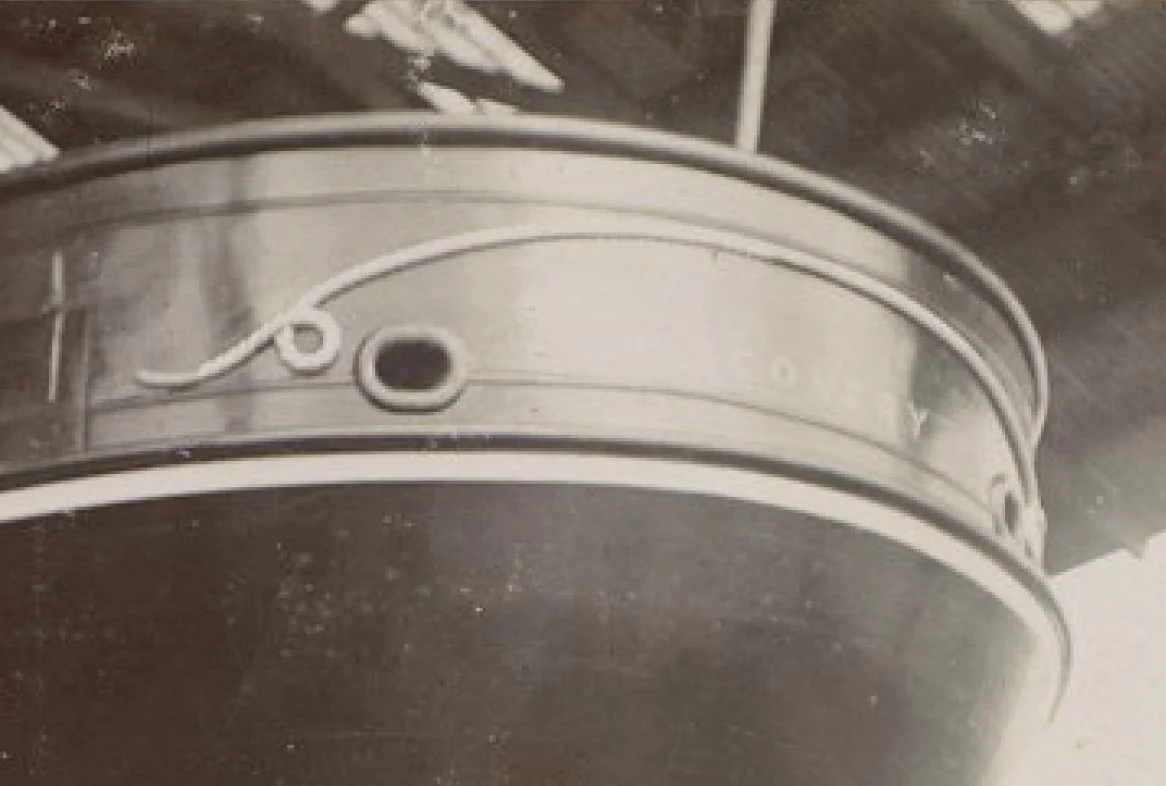
Going through the online archive was extremely valuable, helping me better understand the ship’s launch and its remarkable history. Julie also shared links to other items from the time, such as a menu from the first expedition.
Beyond the ship itself, I researched imagery from early 20th century Dundee, as well as the city’s crest and associated symbols, seeking inspiration in all these places.
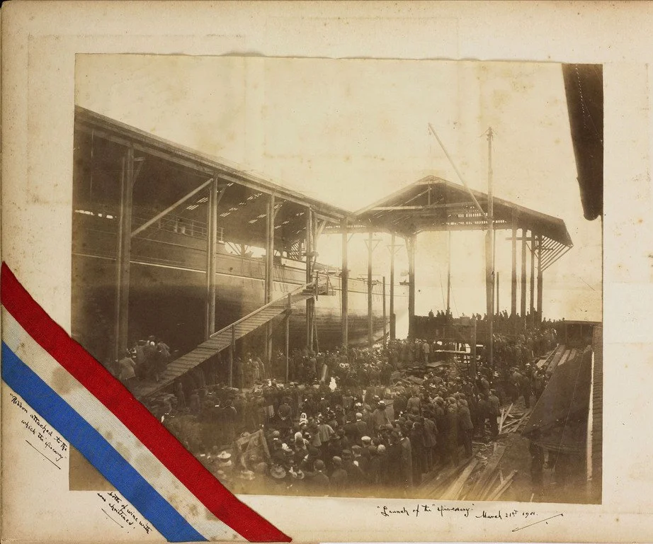
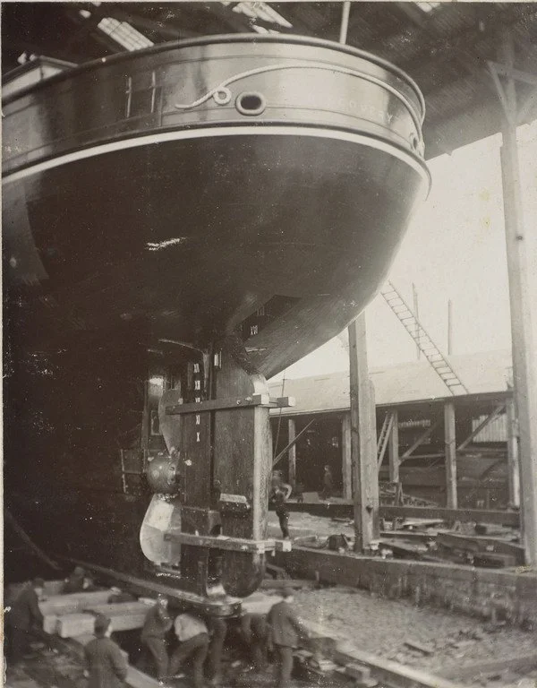
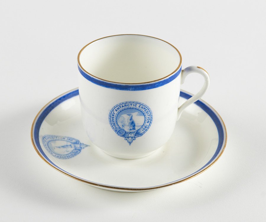
Items from Dundee Heritage Trust’s archive of the first Antarctic expedition in 1901, along with images found online. These references helped provide inspiration for my concept designs.
Concept development.
As with a lot of projects, I had an early idea for the logo after seeing the brief, but thanks to the online archive and research, further ideas started to develop.
It was clear to me that the distinctive silhouette of the Discovery was going to be a key element of the logo, and simplifying the appearance of this from the current Discovery logo would be beneficial. The existing logo is highly detailed, featuring multiple sails and rope lines. While visually rich, this level of detail can become difficult to reproduce clearly at smaller sizes.
Colour was also an element that I focused on, given that the existing logo colours perform poorly in terms of contrast and therefore legibility. Through online research, navy and mid to dark blues were commonly seen in items related to the ship, its first expedition and Dundee’s Coat of Arms.
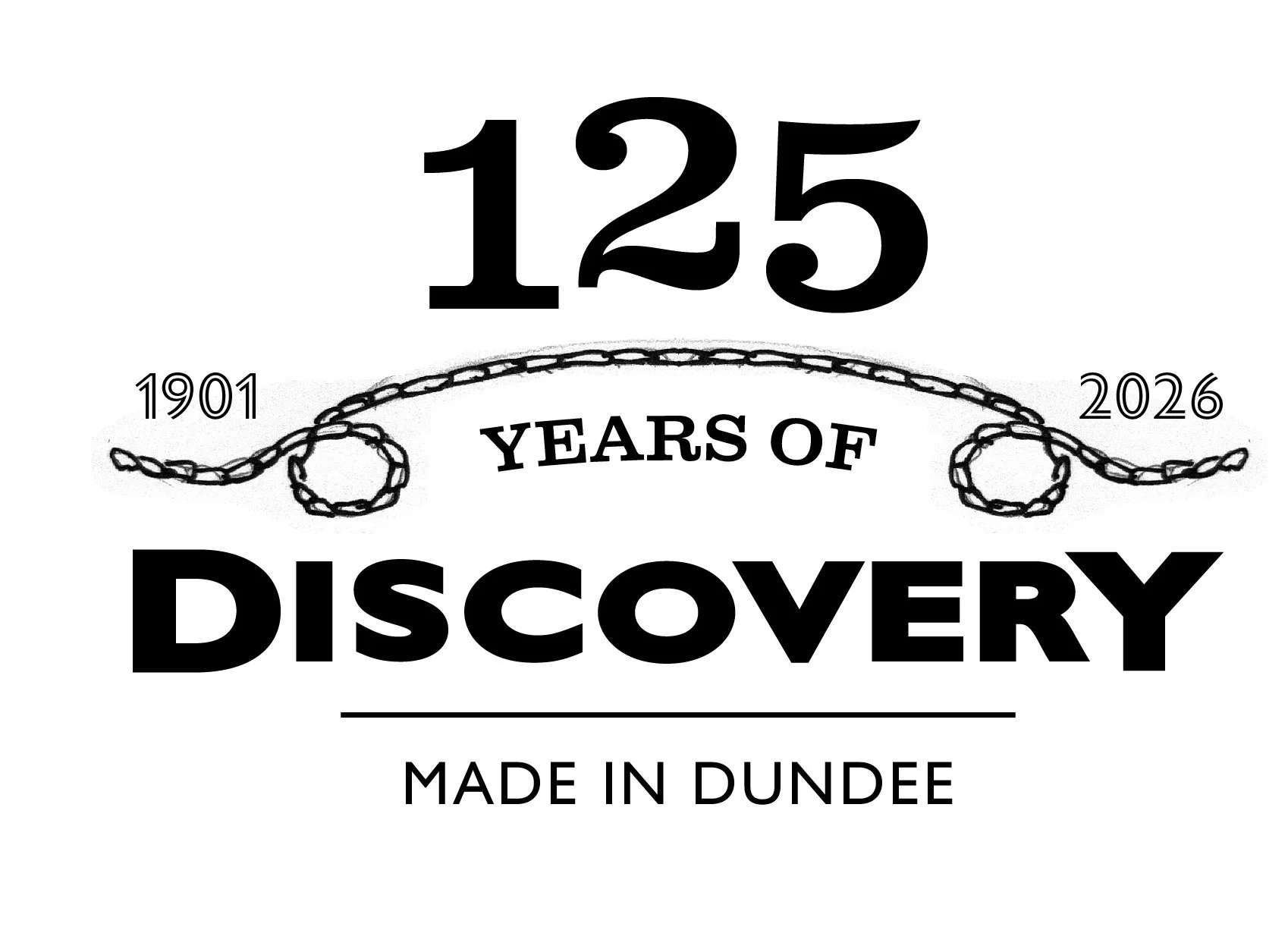
DHT had specified that Gill Sans should be used for typography, to be consistent with their current branding, but I felt that the logo also needed a serif style to help reference the original period. After exploring different options, I chose Clarendon Wide for the ‘125’ numerals. Its bold, decorative style reflects the typographic character of the early 20th century while remaining clear and legible in modern use.
Within a week of beginning the project, I developed three early concept ideas to present to Julie. The first was my initial idea and the others were inspired by items in the archive. These were shown in quite a rough form to get the ideas across and presented over a Teams call. I was really happy that Julie had a very positive reaction to concepts 1 & 2.
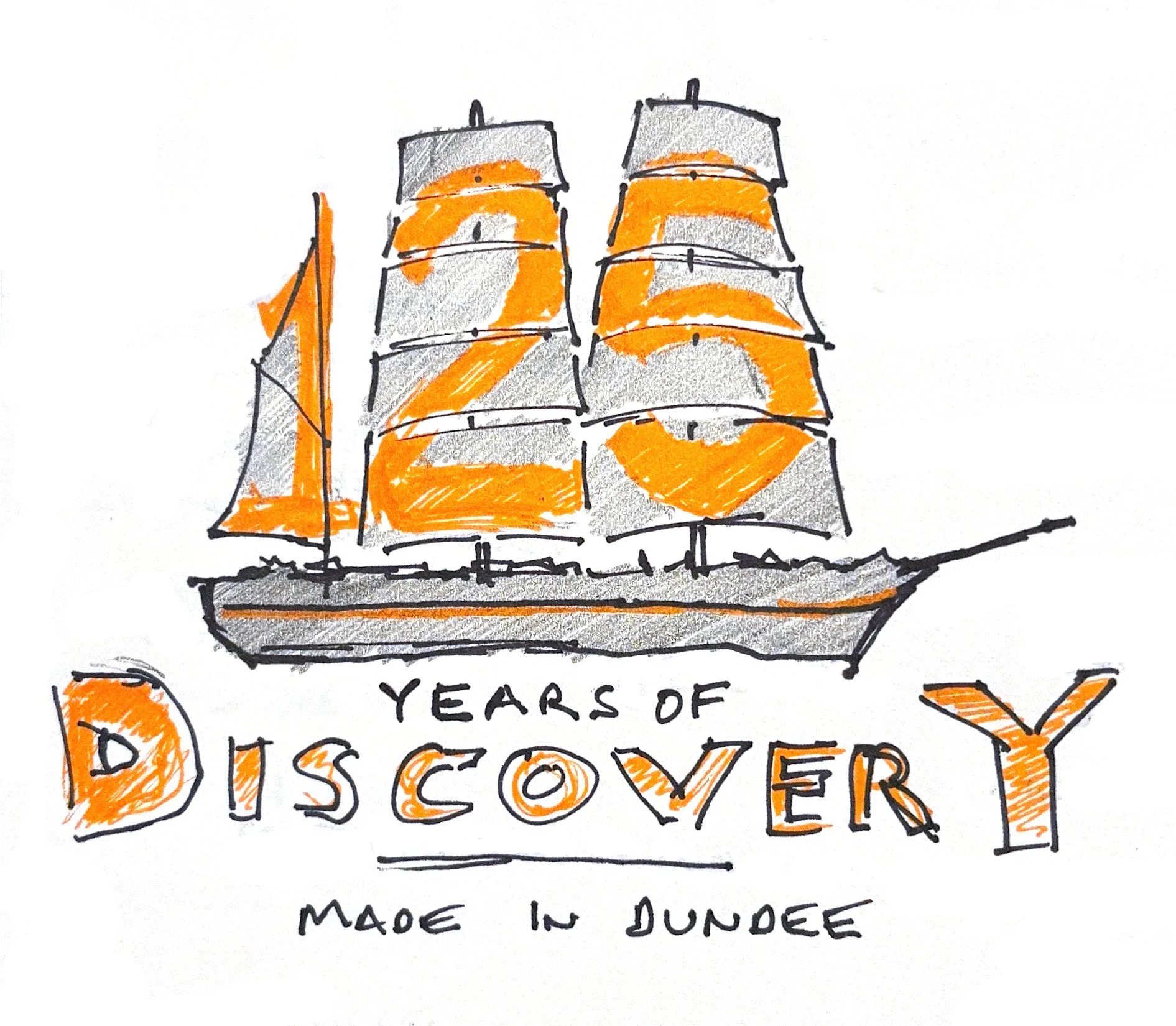
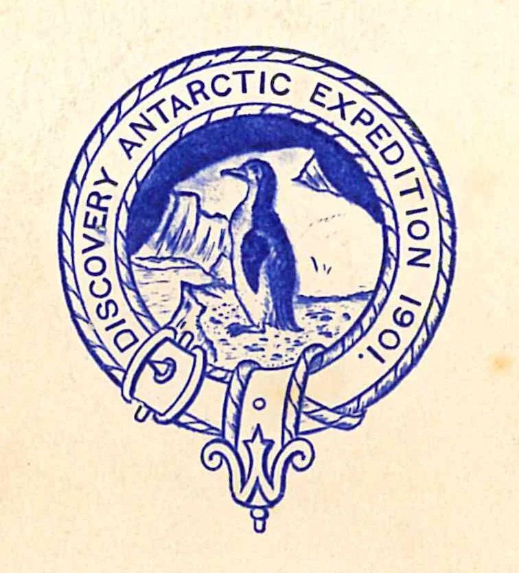
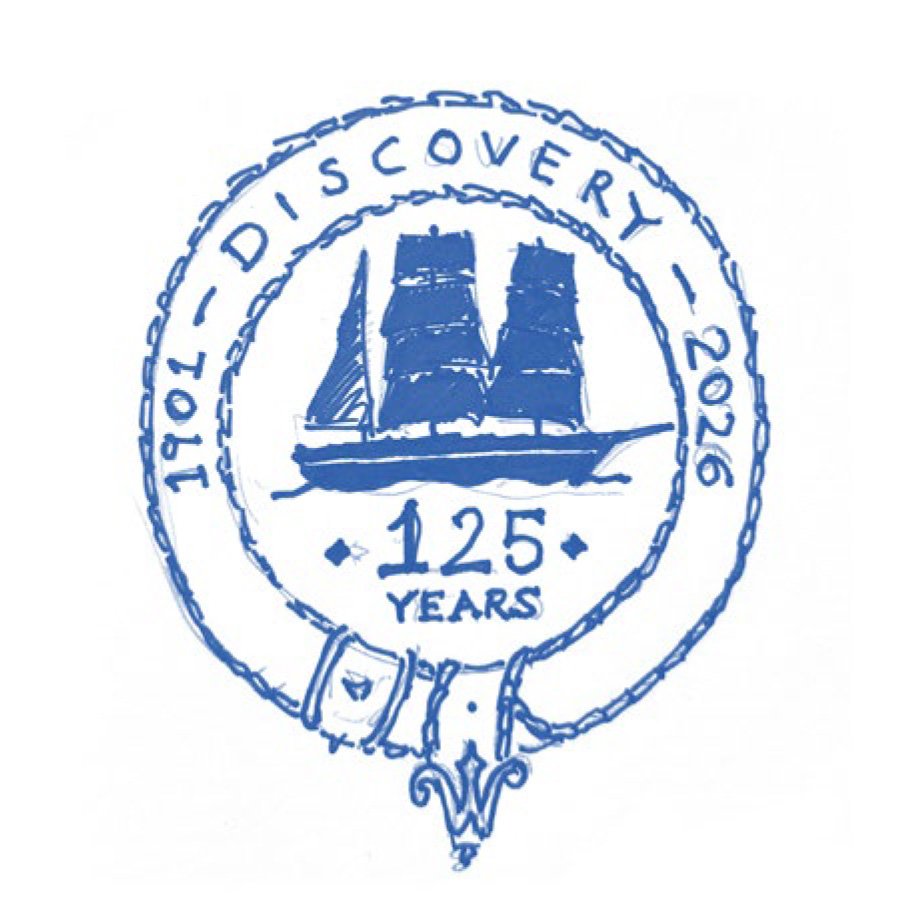
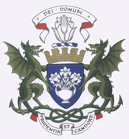
Three concepts were developed, the above images show their original rough form or point of inspiration, as well as a slightly more polished version to help communicate the idea. Concept 2 drew inspiration from the crest used during Discovery’s first expedition, providing a strong historical reference point.
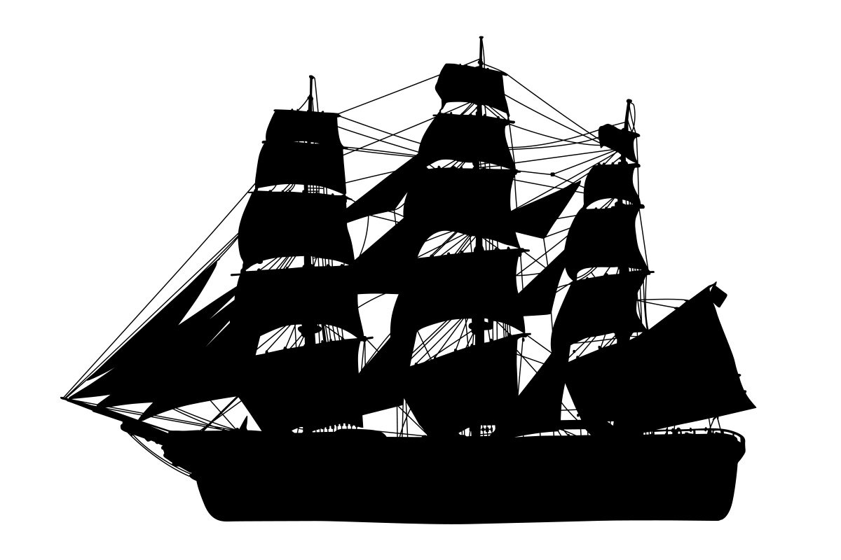
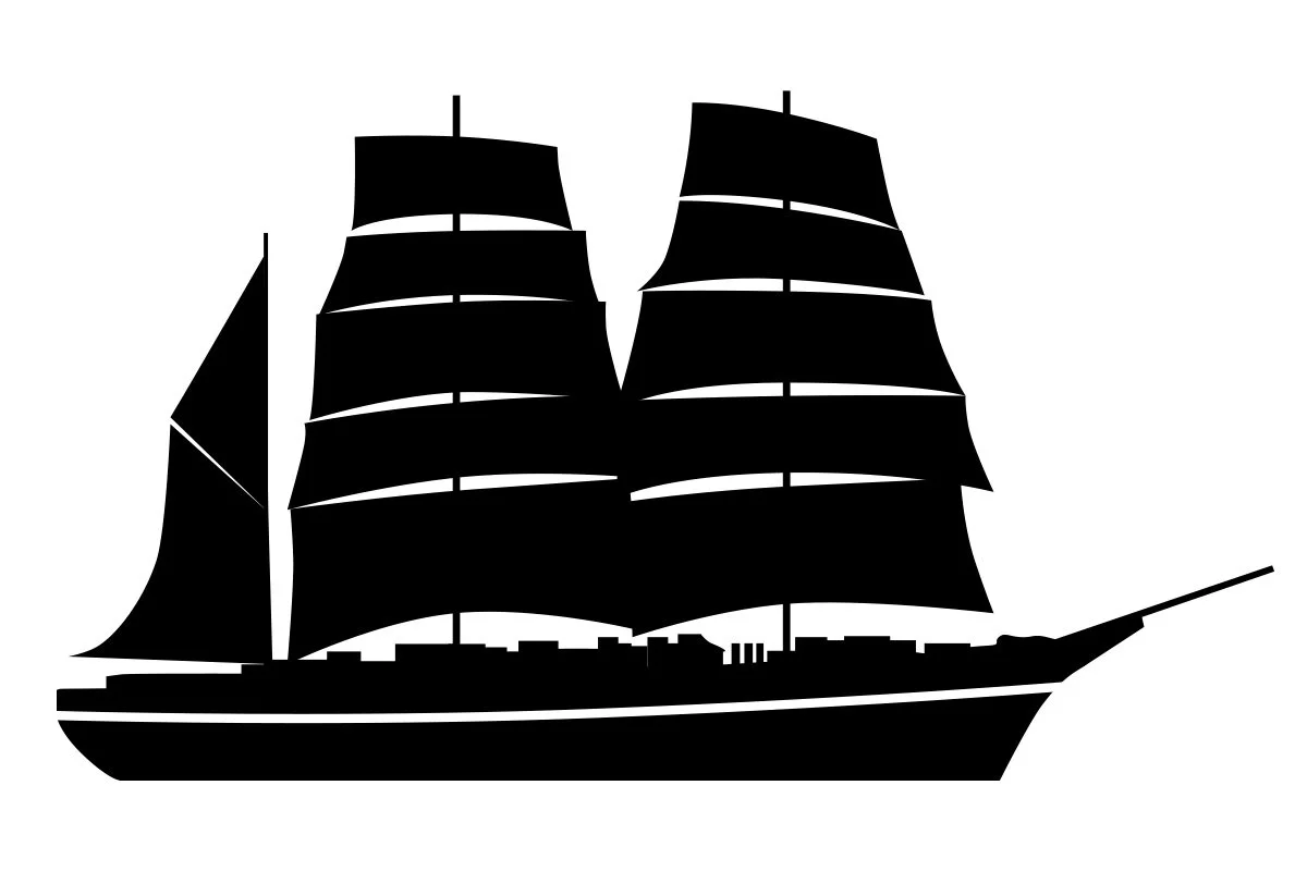
Comparing the complex silhouette seen in the Discovery logo with a simplified version focusing on its three main masts and distinctive bow. I also decided the ship would be better facing right, to be in the direction that you would read the accompanying typography
“Alastair was a pleasure to work with. The timelines on this project were tight, yet we were impressed by just how much research and concept work Alastair managed to develop. His dedication to understanding Discovery’s story, and Dundee’s wider story really brought the project to life, and aligned perfectly with our values here at Dundee Heritage Trust. ”
Design.
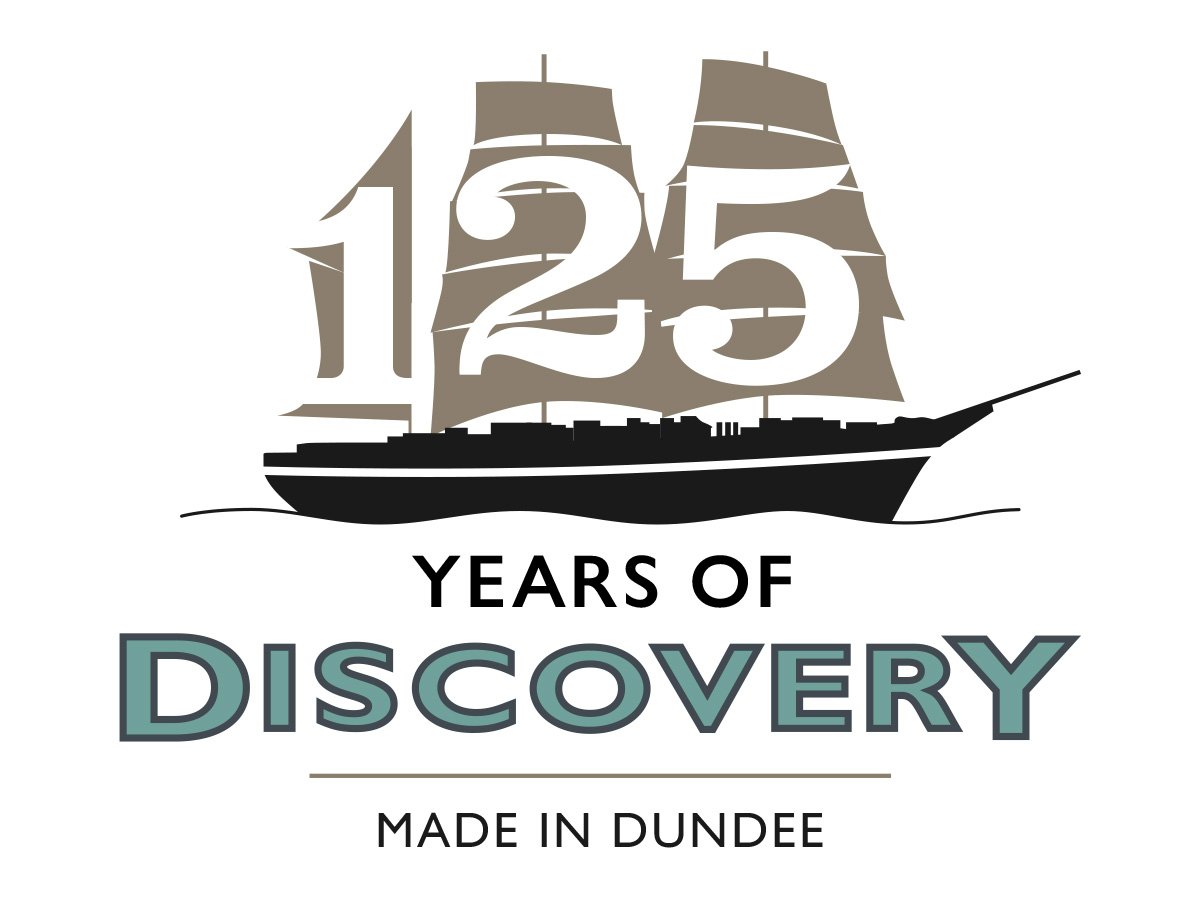
Julie shared the concepts with the wider team and after a few days a decision was made that Option 2, inspired by the first expedition’s crest, would be taken forward. It was confirmed that the ‘buckle’ within the original logo was a decorative element, so I decided to remove that and use the space it left to hold ‘Made in Dundee’ within the surrounding frame.
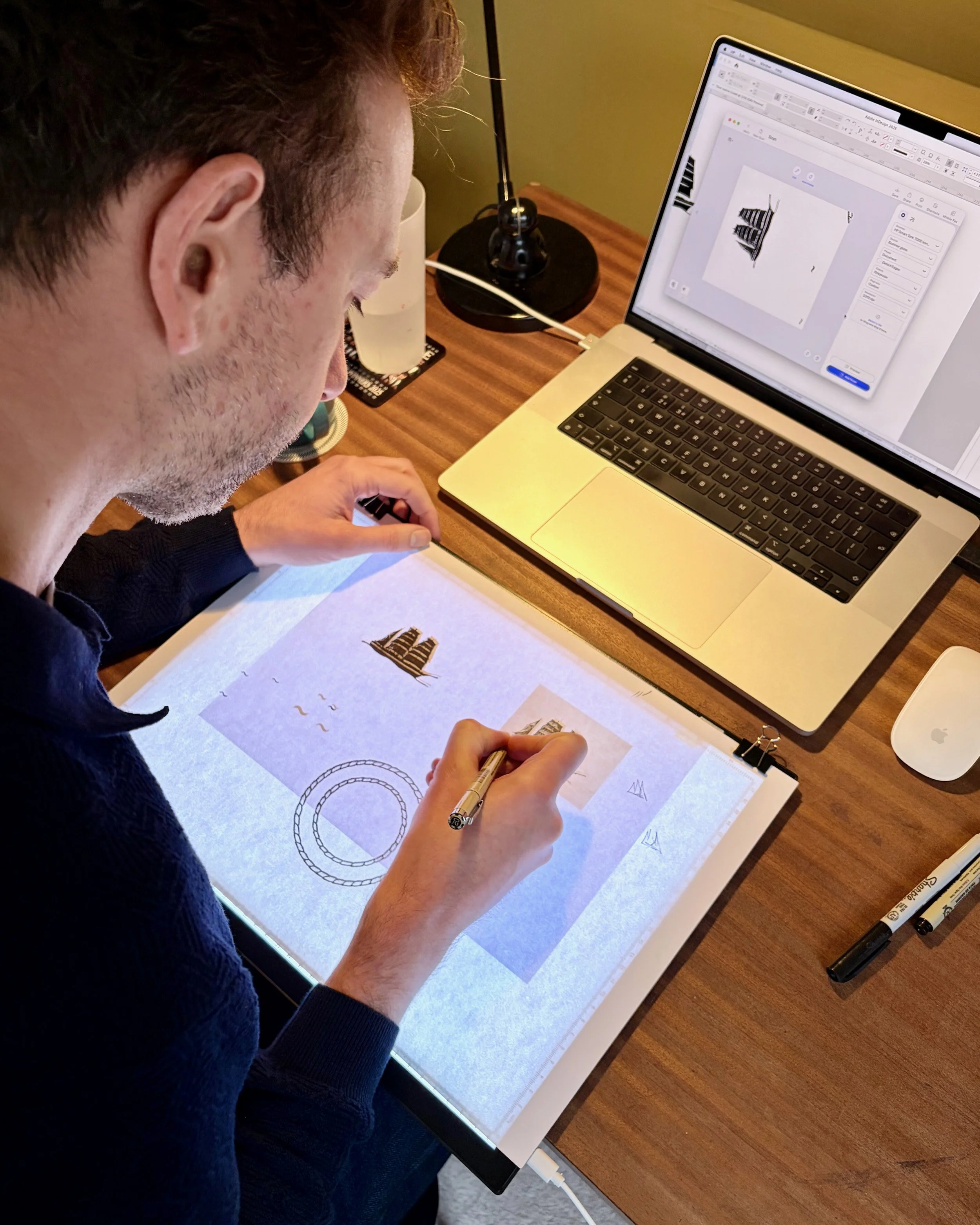
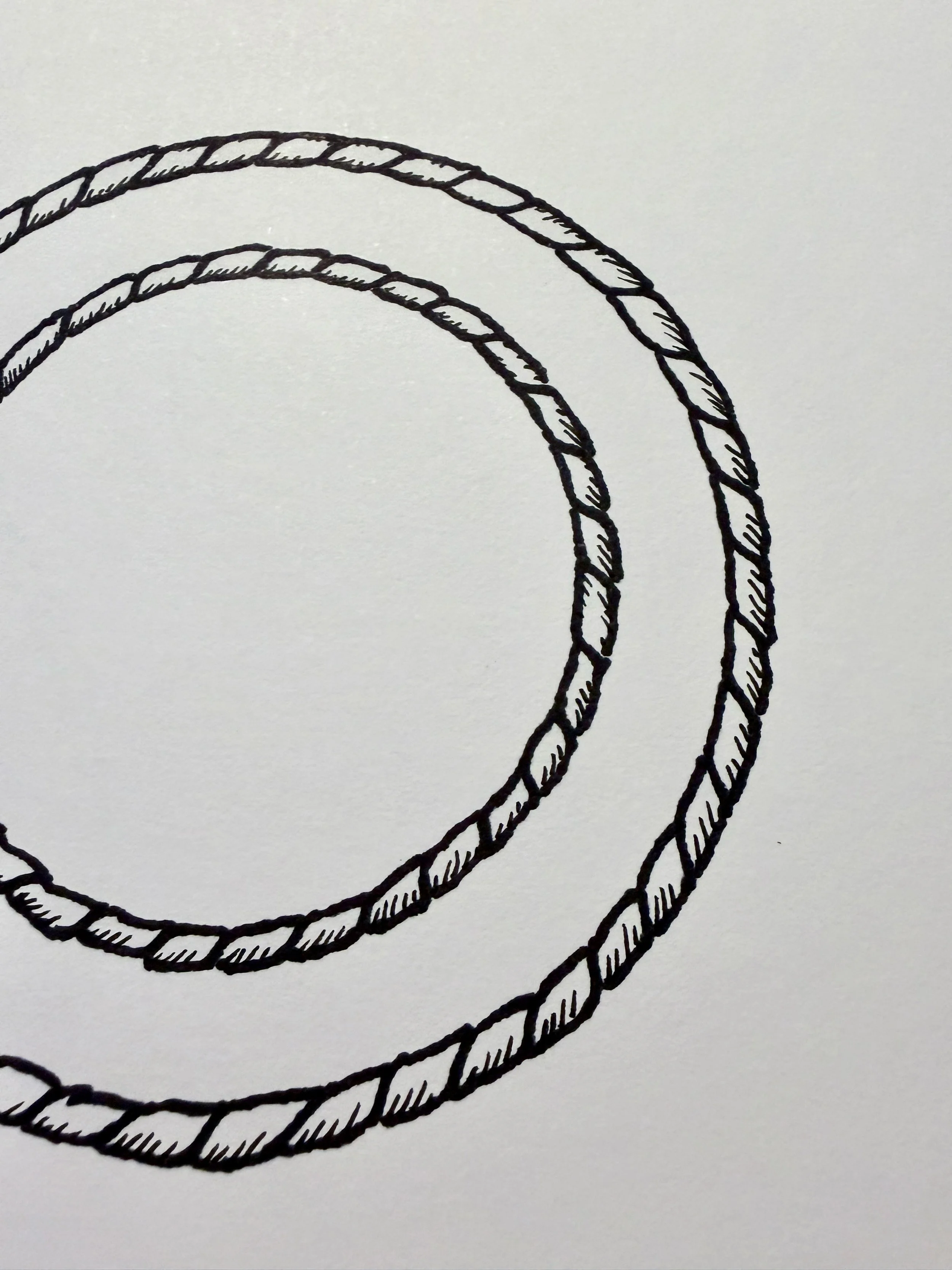
I wanted to achieve the hand-drawn quality of the original logo in the new version, so using a light box I traced out the circular rope frames, ship silhouette and ornate details. I created different versions of the silhouette so I could understand how they each worked when combined with the other elements and when colour was applied.

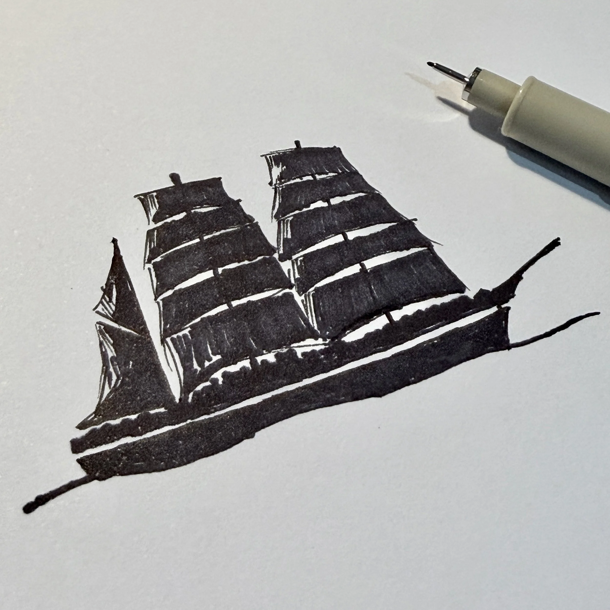
Elements of the logo were hand-drawn to capture the character and craftsmanship of early expedition-era design.
Scanning and live tracing the drawings into Illustrator, I was able to clean up the images while retaining the rougher hand-drawn style. I then composed things together and the logo started to take shape, working particularly well on a white background.
Sampling the blue from expedition items in the archive, I developed a colour that referenced the ship’s original era. After testing the colour in print, I refined the values to retain its vibrancy – creating what became ‘Expedition Blue’.
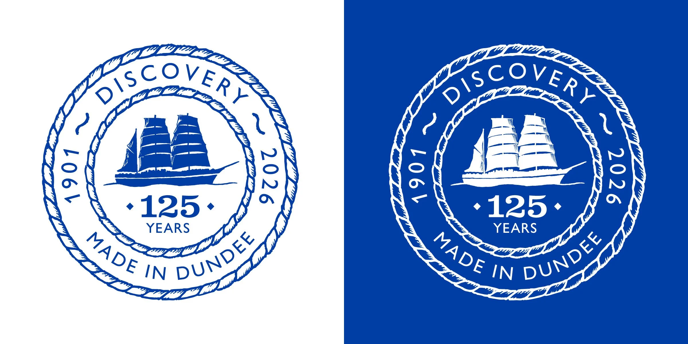
When testing the logo in reverse (white on a coloured background), the highlight lines used in the sails didn’t translate well. To resolve this, I redrew the shading to ensure the silhouette remained clear and balanced in both colour and reversed versions of the logo.
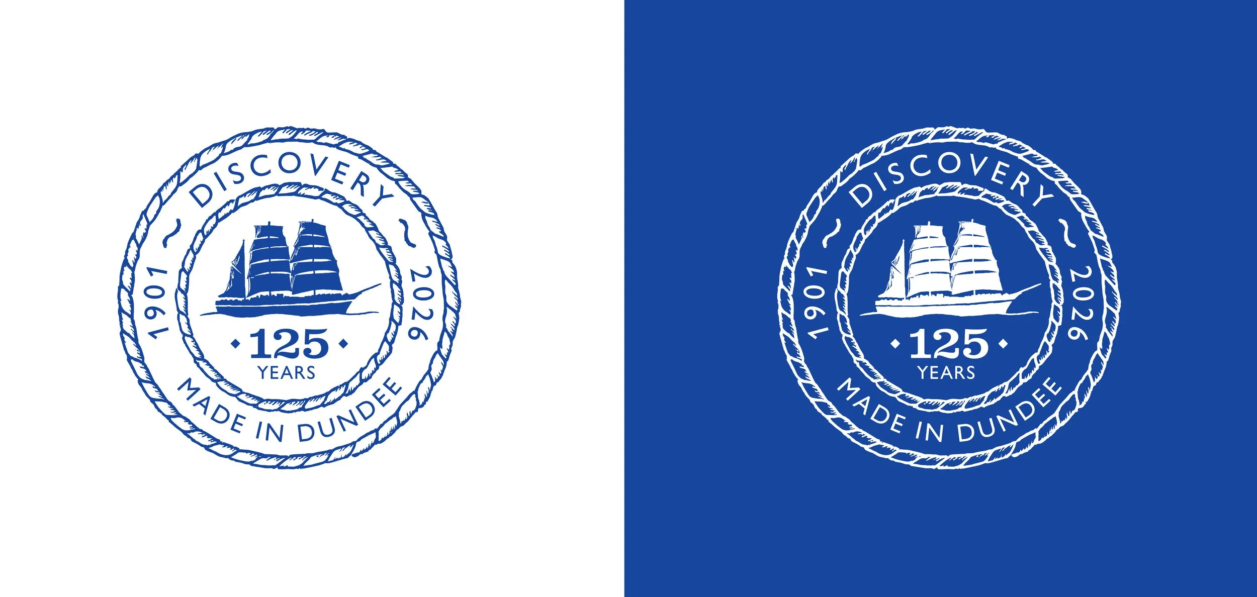
Refined versions of the logo in positive and negative colourways were presented and I included some visual mock-ups to show how the logo would look on some merchandise. The team approved things and we were all getting excited to see things at the event.
The drawn and composed logo – the shading lines on the sails didn’t work as well when the logo was in white, leading to those details being redrawn.
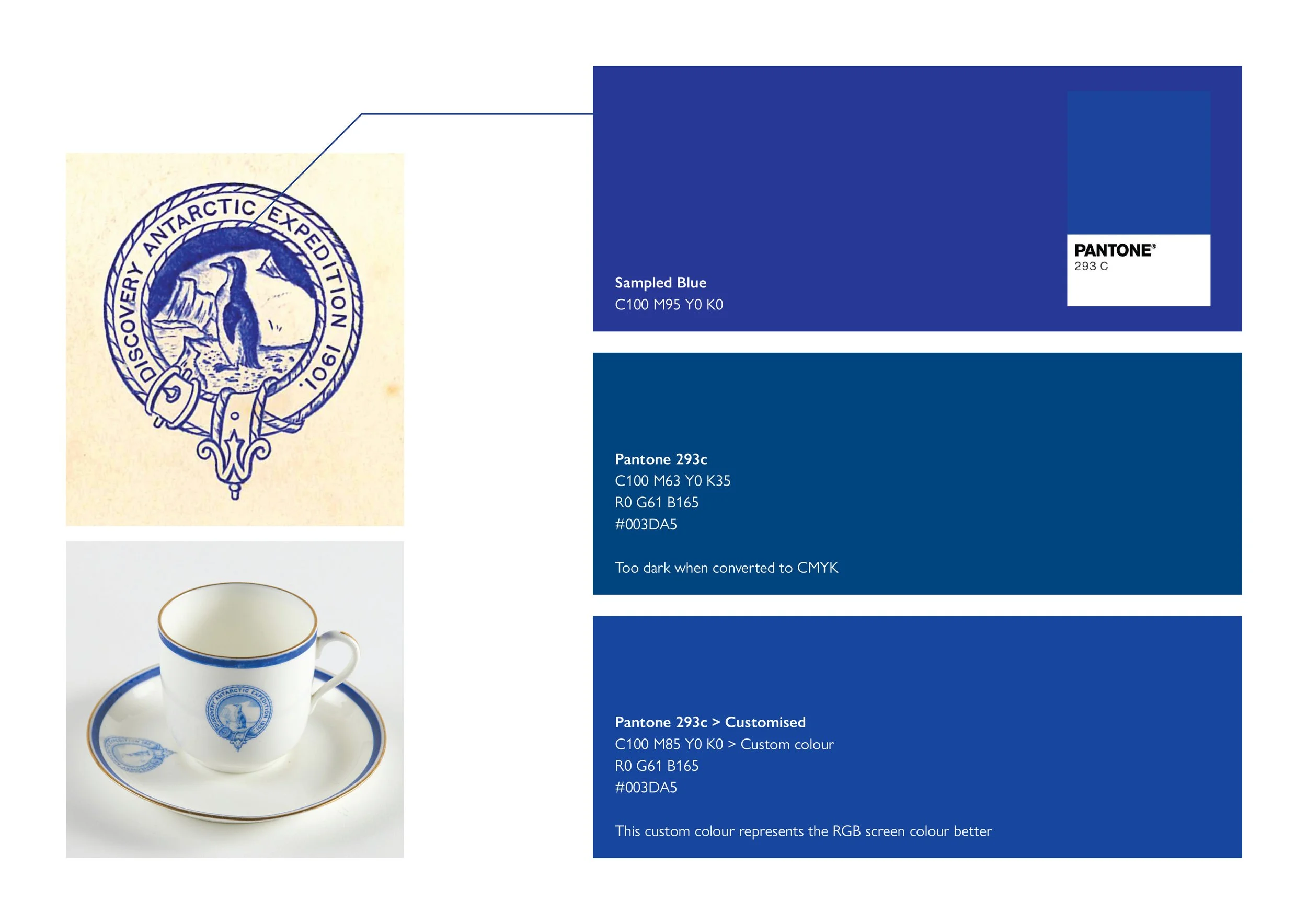
‘Expedition Blue’ was also inspired by items from the original expedition. Care was taken to make sure the colour is vibrant in print as well as on screen.
“Julie and the team were great to work with, and there was a real sense that we were pulling in the same direction.”
“Alastair was responsive to communication, and truly listened to our input and thoughts as the project evolved. The whole team are delighted with the resulting logo, and it has become a real symbol of pride in RRS Discovery and its anniversary milestone, not just amongst everyone at the Trust, but the community.”
Artwork & guidance.
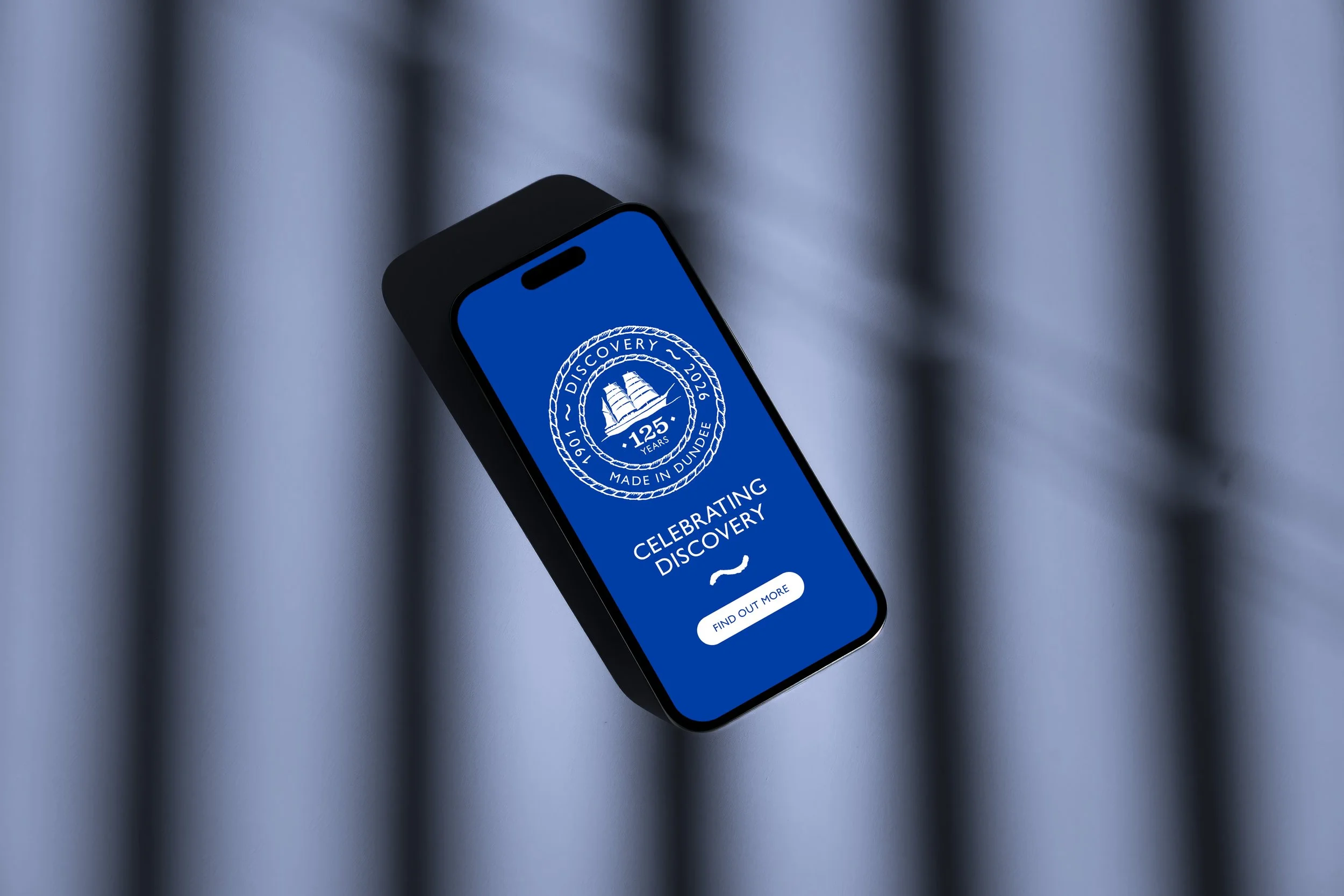
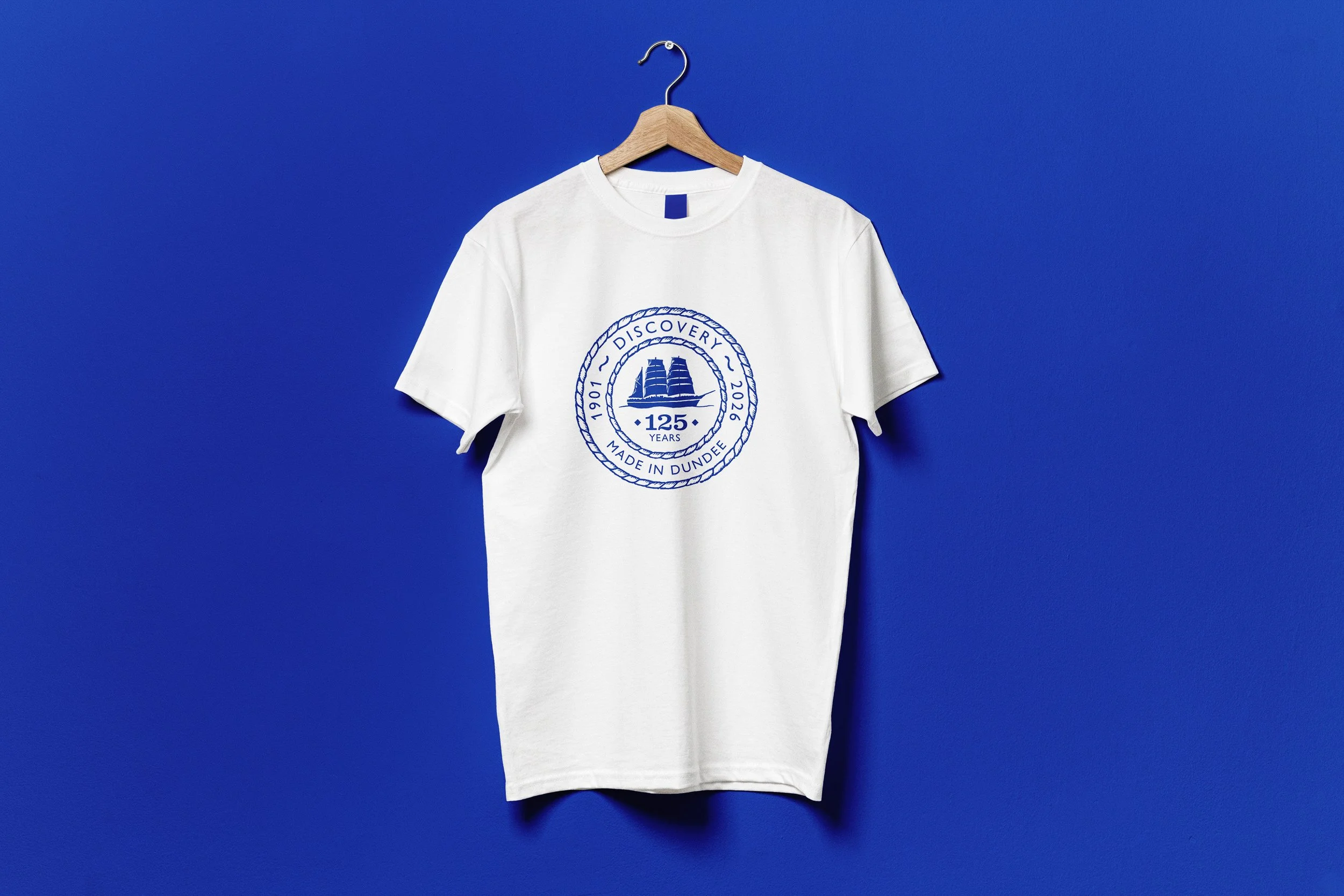
With the positive and negative versions of the logo approved I produced the final Illustrator artwork files, providing positive and negative versions of the logo in digital and print formats.
Alongside the artwork, I created a concise guidance document to ensure the logo could be used consistently across marketing, merchandise and digital applications.
The project was turned around on time, allowing DHT to produce marketing items and merchandise ahead of the 125th anniversary at Discovery Point.
Projects like this are a reminder of why I love what I do – allowing research, collaboration and discovery to shape the creative process, and using design to connect people with stories, heritage and place.
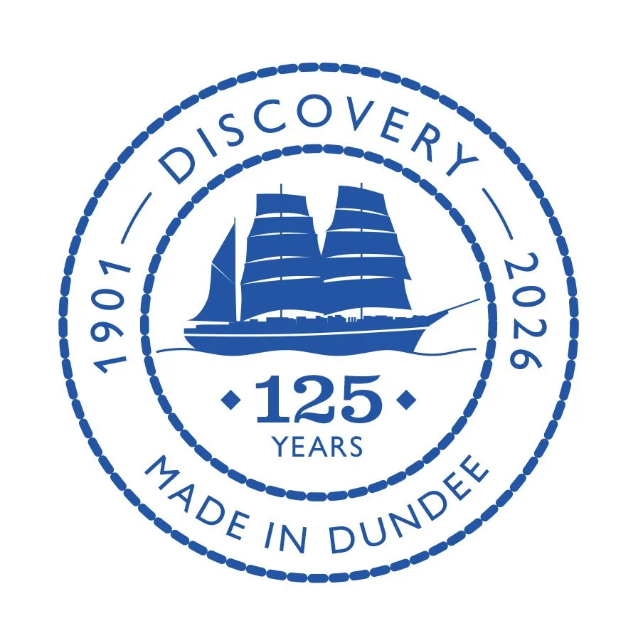
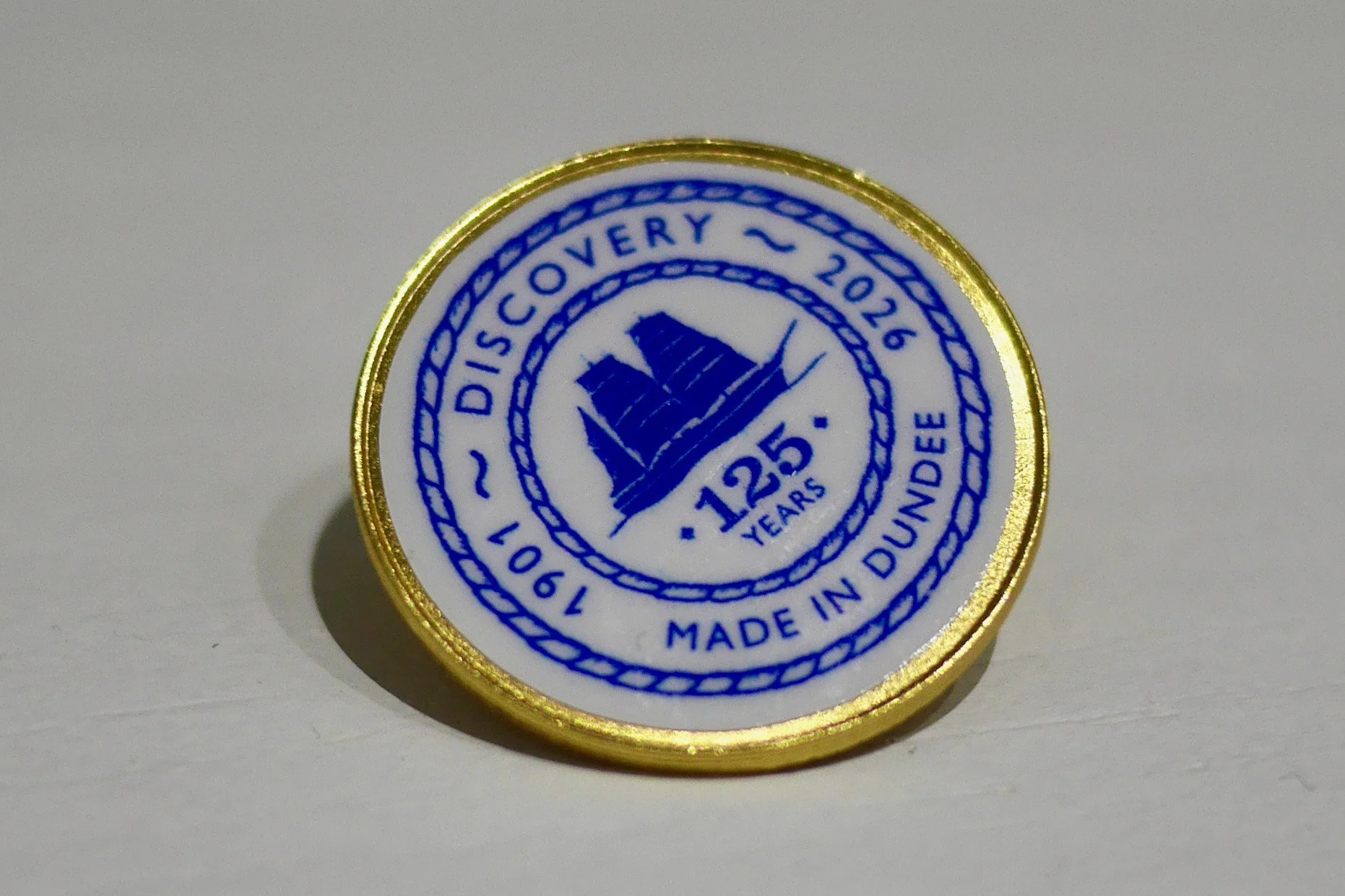
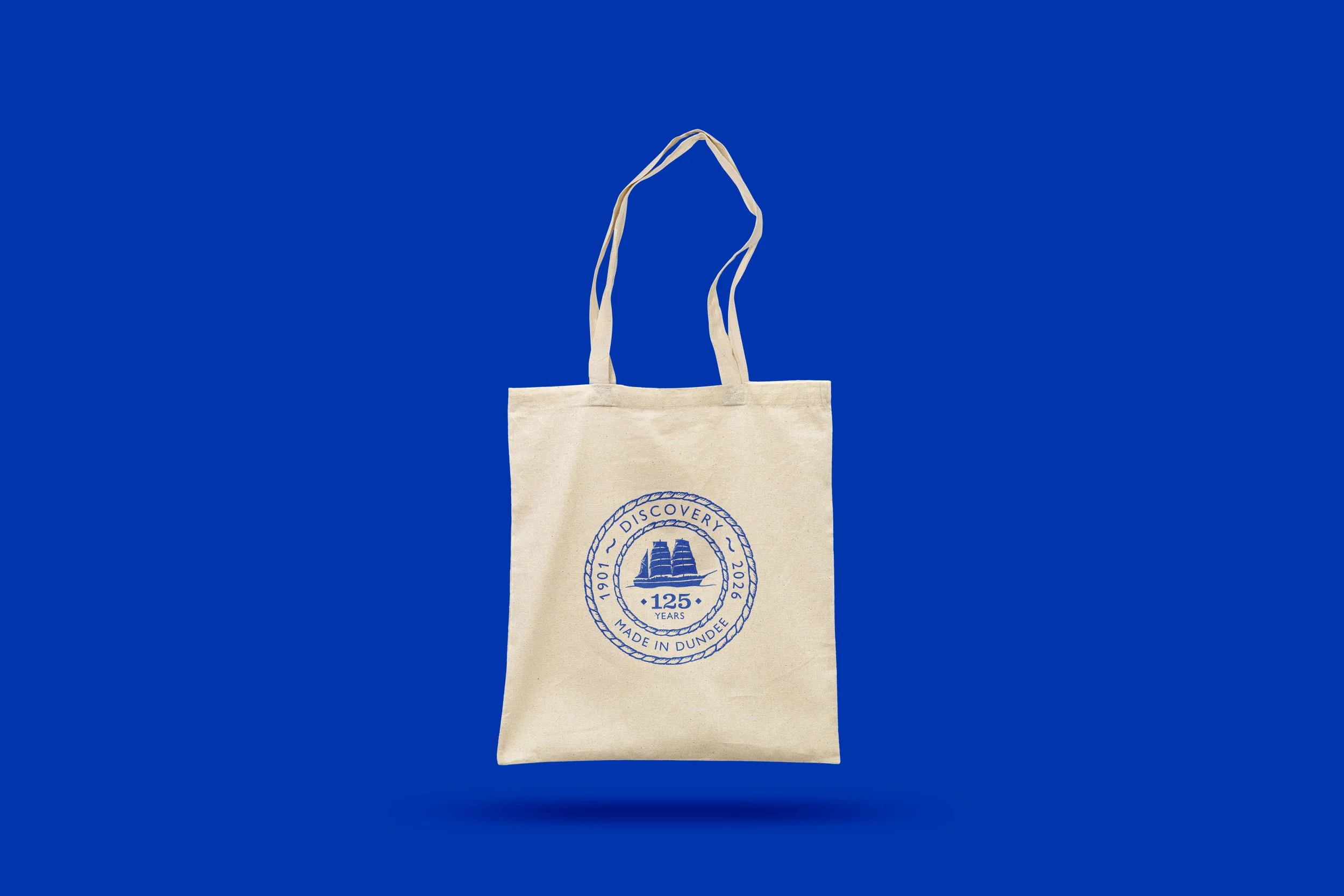
The final versions of the anniversary logo

“Being able to celebrate the story of the Discovery through a design that calls back to its first Antarctic expedition feels very special, and a fitting way to help celebrate an important moment in Dundee’s history.”
“Alastair intertwined his passion for Dundee with creative prowess and a deep respect for, and fascination with, the history of RRS Discovery to design a logo befitting this remarkable ship.”
Design highlights.
Hand-drawn logo inspired by the ship’s original expedition crest
Simplified silhouette of RRS Discovery for clarity and reproduction
Custom colour ‘Expedition Blue’ developed from archive materials
Positive and negative logo versions for flexible use
Brand guidance provided to ensure consistent application
Like what you’ve seen?
If you're looking for a distinctive brand identity rooted in research and storytelling, I’d love to hear about your project.